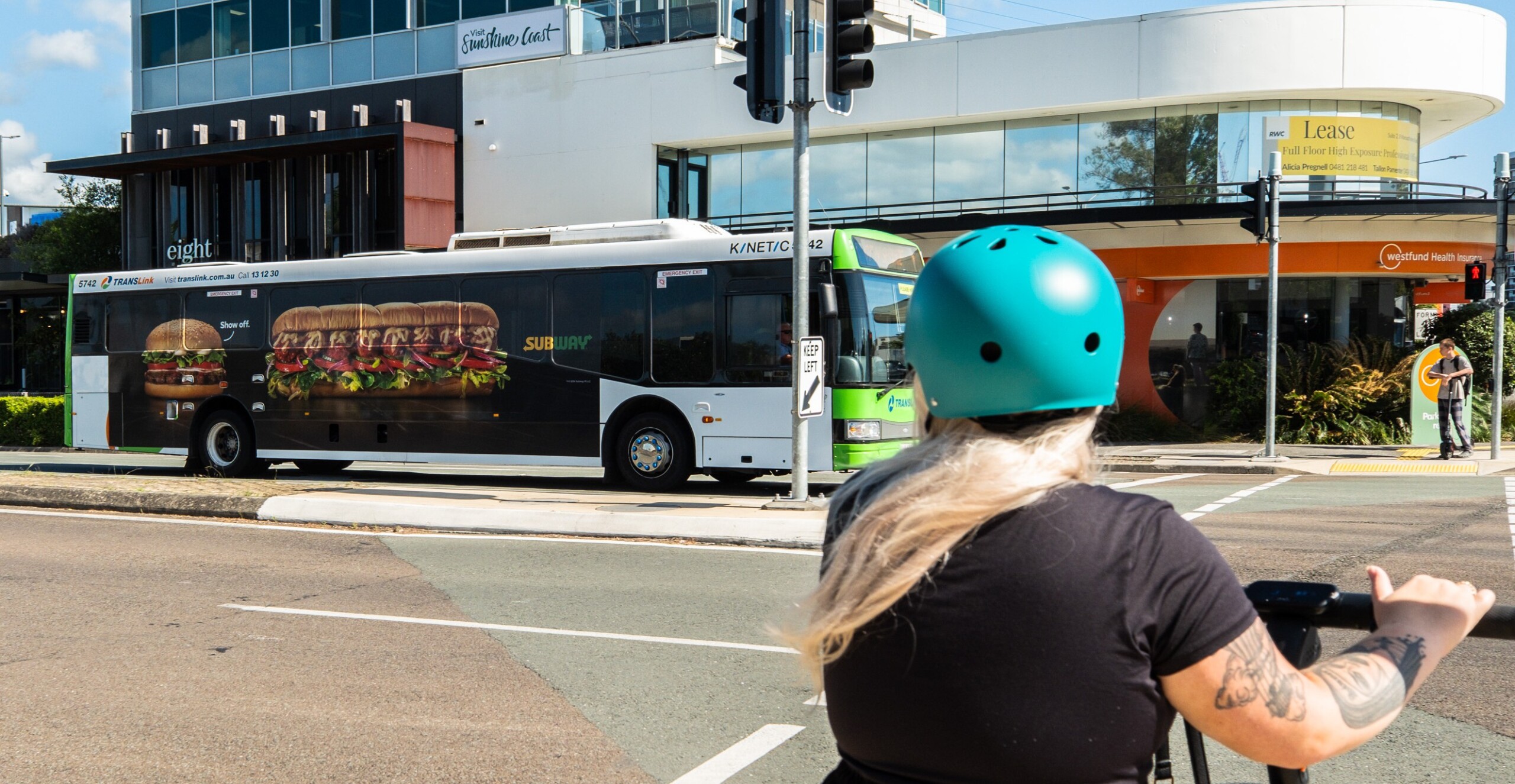
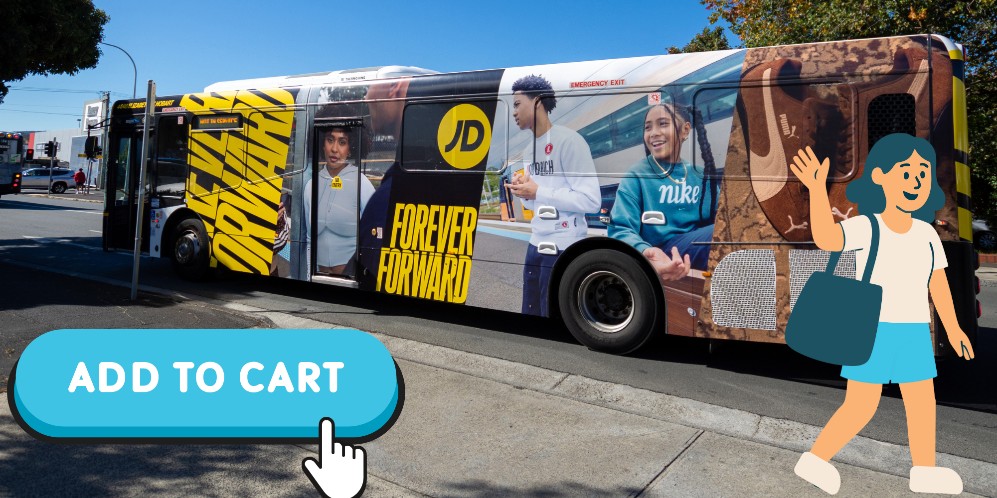
Less really is more: embracing negative space in transit advertising turns a split-second glance into instant brand recall. Skip the pixel clutter and give your message room to breathe.
When it comes to transit advertising, your message has only seconds to grab attention as buses, taxis, and light rails go by. So how do you make every moment count? The secret weapon isn’t adding more… it’s using less. Enter negative space, the unsung hero of great design.
What is Negative Space, Anyway?
Negative space – also known as white space – is the breathing room between design elements. It isn’t wasted real estate; it’s the visual pause that lets your brand message sink in.
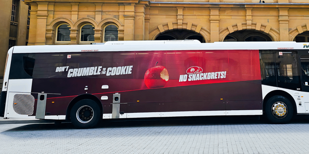
Why It Matters Even More on Moving Media
- Split-Second Impressions
Your audience has roughly 3–5 seconds to decode a bus wrap as it whooshes by. Crowded visuals force a mental traffic jam; generous spacing fast-tracks understanding. - Focus & Recall
Studies in OOH design show that ads with clear focal points enjoy up to 30 % higher brand recall than “Where’s Waldo?” layouts. - Readability at Distance
A commuter 25 metres away can read a six-word headline set in bold against open space—but not if it’s battling a wall of icons, hashtags, and the office dog’s Instagram handle.
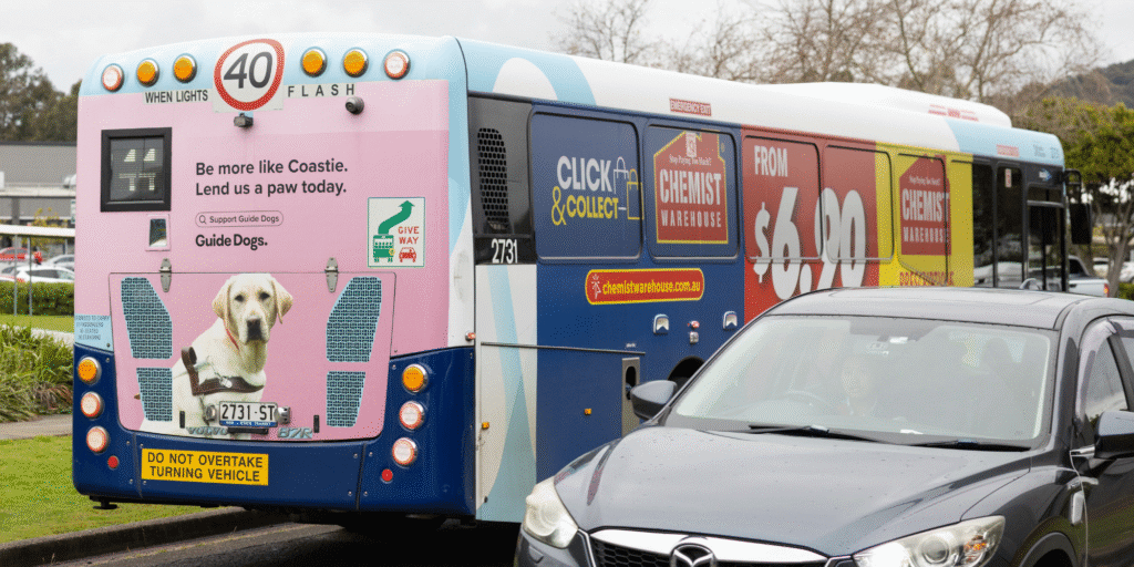
Common Crowding Culprits
| Usual Suspect | Quick Fix |
|---|---|
| Too many call-to-actions | Pick one heroic CTA |
| Wallpaper of logos & badges | Use a single, recognisable mark |
| Copy that reads like a terms-and-conditions scroll | Aim for 6–8 words max |
| “Just make the logo bigger” syndrome | Let whitespace frame the logo instead |
Design-Smart Tips to Let Your Ad Breathe
- Start With One Core Message
If you can’t tweet it in a sentence, it won’t fit on a bus. - Think in Zones
Divide the surface into primary (hero image + headline), secondary (supporting graphic), and tertiary (logo/CTA) zones… then ruthlessly delete anything outside them. - Contrast Is Your Hype-Man
High contrast between key copy and background negative space rockets legibility. - Test at Tiny Scale
Shrink your design to 5 cm wide on-screen. If it still reads, you’re golden. - Embrace Colour Blocking
A solid brand colour next to generous emptiness is more eye-catching than a rainbow confetti explosion.
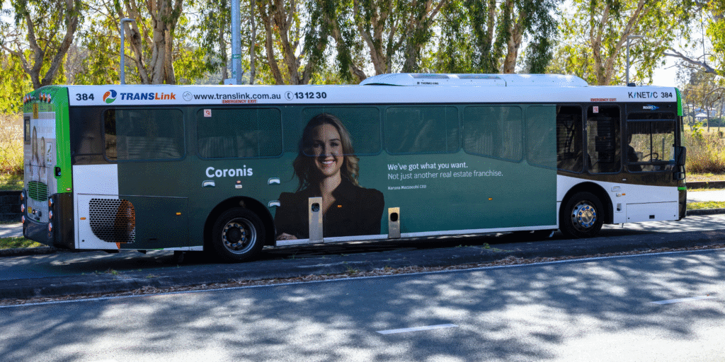
In outdoor advertising, less truly is more. Negative space turns a fleeting glance from a passing bus into a meaningful connection with your brand. By resisting the urge to cram, you’re not leaving money on the table. You’re making every centimetre work harder.

Have a question about something in this story?
Send us a message or have a chat to our friendly team.
Get in touch